That Funky Bandaid Color
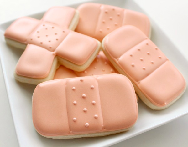
When it comes to cookie decorating, sometimes an exact color match is not the best way to go. Bandaid cookies are the perfect example.
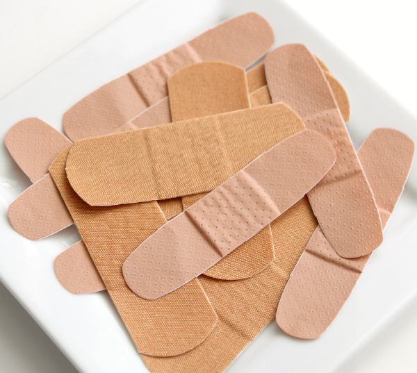
That bandaid “fleshtone” color is kind of icky and doesn’t always translate well to cookies, not to mention being frustratingly difficult to match.
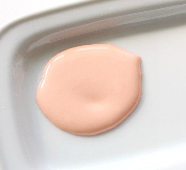
So, in the interest of pretty cookies and sanity I made a lightened-up version.
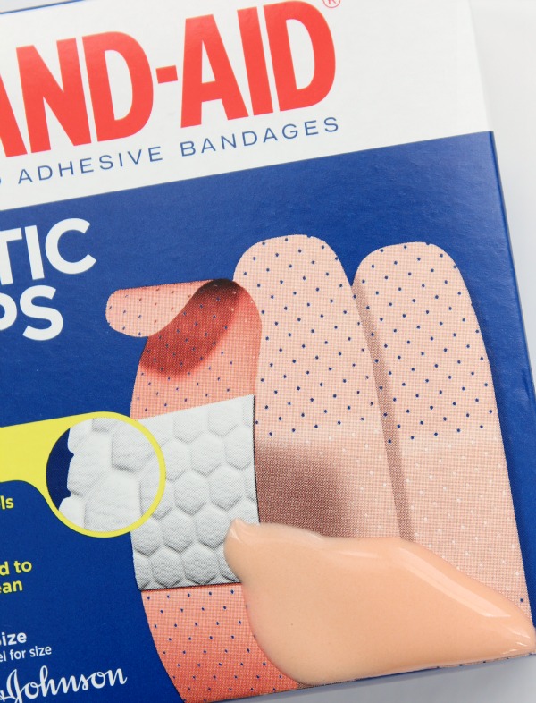
Begin with about 1/2 a cup of icing and add one scant drop of tulip red, and 3-4 drops of ivory. The result is a little brighter than the real version, but pretty close to the shade on the box.
If you have leftover icing, it doubles well for fleshtone {or as a base for darker colors} which you can use to make nurse cookies!
Moral of the story, when it comes to color, don’t let yourself become boxed into exact matches. When it comes to cookie art, often an interpretation is better than the real thing.
Have a great weekend cookie friends!





This is so true – sometimes the exact color would make for a pretty icky looking cookie! I’m not super great at color matching, but I think usually, if you’re close enough, it definitely translates what you intended 🙂
Great little post and I completely agree! I had the same experience with bandaids. For cookies, I just couldn’t do that eery peach color. So glad you’re back and feeling better! Happy 2013!
Hi – any ideas on how to create “Tiffany” blue??
I would use a touch of teal, or the combo on my color chart which you can find here. https://www.sweetsugarbelle.com/blog/2011/03/color-chart-and-printing-help/
thank you so much!!
Pantone has this color as a hot pick for 2013. I picked up a designer purse at a store and told the gal, this is the strangest bandaid color…she said it is called Affogato. Thankfully I knew what that was and have made it, so I kept my cool factor in check. Melted ice cream in espresso or band aid? You decide! But band aid cookies? Yep, all day!
ICK. The color I will NOT be wearing this year. Is it prettier as a purse?
Hahaha! The purse was very pretty (Kate Spade) but it was a little too serious for me. I bought bright turquoise! I am so not serious!
That’s why we’re friends. I’d have done the exact same thing!
I LOVE THIS POST. I sometimes get SO stuck inside the “box” …
Love it!
You HAD to go and post this, nearly a year after I actually made band-aid cookies, didn’t you?! LOL
And you know me….I went the “authentic” route with that color. (should have noted how I did it. Oops! )
In hindsight, not exactly an appetizing color….you’re SO right about that. 😉
This color is SO much better than true bandaid color…Eating a bandaid cookie that had the color matched exactly would probably ick me out a bit. =P
Thank You!! I know you’ve shown some ‘new’ color ‘how-to’s’ recently…(remembering the green around Halloween)….and I really appreciate your figuring out and sharing the ‘formulas’. Are you planning to include this as a new color to your existing chart or will you create a new chart? I’m so afraid I won’t be able to find this when I end up needing it!
If you have the original chart printed out, I would write it on the back. I don’t have any plans for a new one soon.
You are reading my mind girl! I have to decorate band-aid cookies today and haven’t started to tackle the coloring. THANKS!!! Love ya! Cristin
Super cute 🙂
Cool color!
great tip Callye, I hope everyone is heathy at your house now 🙂 Missed you XXXOOO!
Seriously, you are amazing! You swatched your icing on a bandaid box! This cracks me up and I love you for it. 🙂
Pingback: 50+ Ways to say, "Happy Valentine's Day" with Cookies
Pingback: Medical Blue Icing Colors - The Sweet Adventures of Sugar Belle