Simplifying Complicated Cookie Designs {Guest Post}
Guess what? We’ve got a visitor today. Don’t you just love company?
I hope by now that you’ve met Jill Wettstein, of Jill’s Funky Cookie Studio, but even if you haven’t you’re in for a treat!
There are about a million reasons to be excited about today’s visitor. Not only is she amazingly talented and sweet, her dedication to the Go Bo! Foundation is truly inspiring.
I could go on and on, but instead I’ll let you read.
![]() We’ve all been there — the daunting task of recreating recognizable artwork on a 3” cookie. Whether it is an exact duplicate of a well-known character or simply a familiar design, if one detail is missing, the whole look can be thrown off. By giving a “wink” to an original design, rather than copying it verbatim, you can achieve a fun, artsy look.
We’ve all been there — the daunting task of recreating recognizable artwork on a 3” cookie. Whether it is an exact duplicate of a well-known character or simply a familiar design, if one detail is missing, the whole look can be thrown off. By giving a “wink” to an original design, rather than copying it verbatim, you can achieve a fun, artsy look.
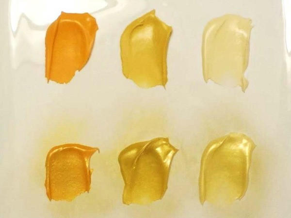
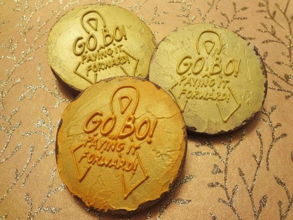
 Creating an unexpected base texture and utilizing a coordinating color palette allows for artistic freedom, yet achieves a familiarity with the original design.
Following Sugarbelle’s “one bowl method” of coloring icing this color palette started with Americolor Ivory, Americolor Gold and Americolor Orange; and ended with airbrushing on Americolor Gold Sheen.
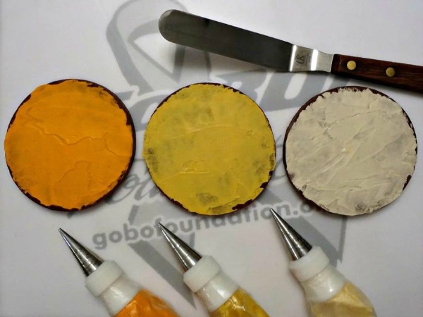
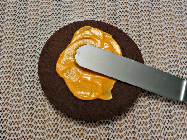
 The unexpected base texture was created by using an offset spatula, blobbing a dollop of piping consistency icing onto the center of the cookie and spreading it around. Think of it like plastering a wall — go wild, spread the icing around, use the side of the offset spatula to create random thicknesses and patterns — let go, get all artsy and creative!
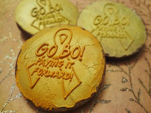
 Once the base texture is dry, pipe your details using the same piping consistency icing used for the textured base. Remember, the idea is to give a “wink” to the design, not to duplicate it exactly.
 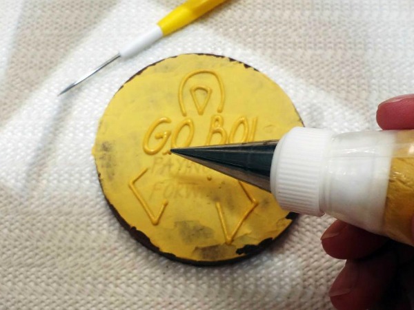 A quick, overall airbrushing of Americolor Gold Sheen or Gold Color Mist Food Spray from Wilton brings a beautiful shimmer and dimension to the plaster effect.
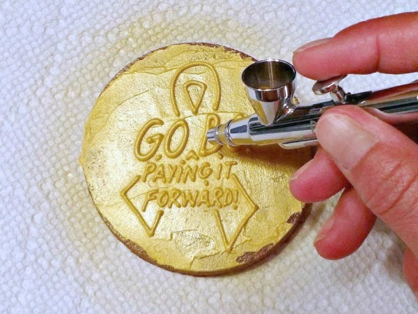 That’s it … in a few easy steps you created your interpretation of a design that inspired you!
If you’re curious about the logo above, here’s the touching story of Bo Johnson and the Go Bo! Foundation.
Bo Johnson was diagnosed with a rare form of Leukemia, EM/AML, at the age of 12. He battled this disease for a year, and lost on September 28, 2012. Prior to his illness, Bo was a normal active boy, enjoying life with family and friends. The illness that took his life could not stifle his spirit or courage. Facing the most serious medical condition, Bo chose to show all of us what it means to “live life to the fullest and enjoy every day.”
Rather than stay in the hospital, Bo made the brave decision to come home to Sister Bay, Wisconsin, to spend his final days watching the sunsets over the waters of Green Bay and spending time with the friends and family who had supported him through his year-long battle. He attended high school football games, went to the beach, and welcomed friends into his home. And, even in his weakened condition, Bo reached out. He asked to speak to his school, where he got on stage to deliver a message to his classmates: “be good to one another, be kind, especially to the weakest among you,” he told them.
Bo reminded us what true courage means, and why one boy can inspire a multitude with nothing more than a smile and a dream to help others.
The Go Bo! Foundation now works to carry on Bo’s message — bringing hope to children with life threatening medical conditions by funding research, supporting treatment, and helping their families during times of financial need.
![]() To keep up with Jill’s cookies, her work with the Go Bo! Foundation, and more…be sure to like her Facebook page.
To keep up with Jill’s cookies, her work with the Go Bo! Foundation, and more…be sure to like her Facebook page.
I hope you’re all having a wonderful week!


Great post Jill! And I love the way those cookies look! I think we get so caught up in “perfection” sometimes we forget that something a littler different and a little fun and a little “funky” can be perfect!
These are GREAT and for such a good cause, I am so glad I get to be a part of this again!
These are great, Jill! I love the way you did the background – and the airbrush makes the details pop! Love your heart and Bo’s message! Thank you for sharing it with us.
Hello,
I am a big fan of your cookies. I love the writing! Usually what consistency do you use to pipe the letters?
I love the way your broke this down, as this is the one area my overly obsessive nature has an issue with. I’ve learned that letting go a bit and allowing myself to come through often produces even better results then trying to copy something exactly!! Love the cookies, love the cause and of course I totally love you!!
The “Go Bo! Foundation” is amazing. Thank you for sharing the story with us Jill!
We all need to print his quote and hang it where we can see it every day.
“be good to one another, be kind, especially to the weakest among you,”
Love the cookies and the icing technique!
Thanks so much for allow me to spread the word about the Go Bo! Foundation, Callye!!!
Wonderful post Jill. Thank for sharing the story behind the Go Bo Foundation.
I love the look of these cookies, it is a whole new art form. Beautiful!
Go Jill and GO BO! 🙂
I love Jill’s creative cookies and to see her in action is great! Her part in the Go Bo Foundation shows she is not only a fantastic cookie decorator, she is a wonderful caring cookie decorator! 🙂
Great post and a wonderful cause! Thanks for sharing!
Amazing post Jill….it is very hard to keep yourself away from going closer and closest ot the original design and close your ways to be creative…i struggle with it…..you do it so well…awesome post!!
Oh, that was hard to read without choking up. All that you are doing for Go Bo! is such a wonderful tribute to his legacy.
Love that you put links to other cookie people also. Although I always go to you first. Honest
thanks